Quick Start Guide + SQL GPT
Get started with Kinetica Workbench
Note
This documentation is for a prior release of Kinetica. For the latest documentation, click here.
Get started with Kinetica Workbench
There are several different options for installing Kinetica on-premises or in the cloud (Azure or AWS).
However, to get started within minutes (and for free) we recommend either of the following two routes:
Kinetica Cloud Free: This is a free managed version with 10 GB of storage, which is hosted in the cloud. Follow the instructions for Kinetica Cloud Free to create an account and launch Kinetica.
Tip
Kinetica Cloud takes only a couple of minutes to set up and is an excellent choice to get started. However it is a shared multi-tenant instance. While your data is private, the compute resources are shared between all users of the cluster.
Kinetica Developer Edition: The Developer Edition is a free personal copy of Kinetica that can be installed on your computer. It requires Docker and 8 GB of RAM. Follow the instructions for Kinetica Developer Edition to install Developer Edition.
Tip
The Developer Edition must be installed locally and requires Docker, but it gives you full administrative access to Kinetica. Also, your computational resources are constrained solely by the resources available on your personal computer.
Workbench is the primary interface for querying and managing Kinetica.
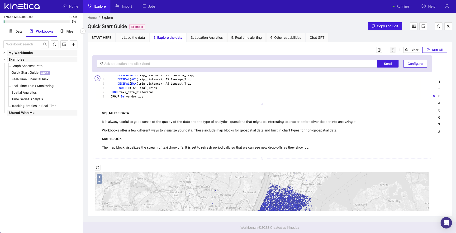
SQL GPT, an integration with ChatGPT for writing queries using natural language, is built into each Workbook within Workbench. For details, see SQL-GPT.
Workbench is available based on which option you selected:
Kinetica Cloud Free: Workbench will be the interface presented when logging in.
Kinetica Developer Edition: Log into Workbench once you have installed Kinetica at:
http://localhost:8000
Once there, the Quick Start Guide can be reached in either of two ways: